# Carousel
Standard carousel that can accept other components as slides. Comes with standard arrow and dot navigation.
Use for simple carousels in which all the components are the same height.
# Controls
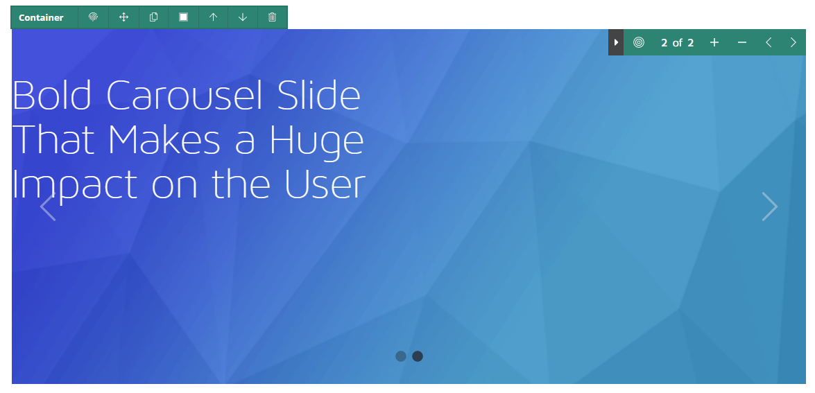
Layered containers come with a control bar on the top right corner. From left to right:
- Expand and collapse toolbar
- Select the carousel component
- Slide count
- Add a slide
- Delete current slide
- Go back a slide
- Go forward a slide