# Nav Dropdown Collection
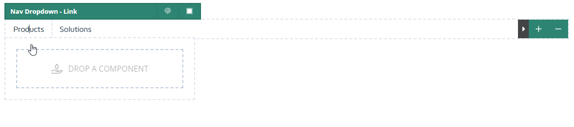
This component tiles nav-style dropdowns from left to right that expand on click or hover.
Use it to quickly create a basic nav and populate the dropdowns with link collections.
 Flex User Documentation
This component tiles nav-style dropdowns from left to right that expand on click or hover.
Use it to quickly create a basic nav and populate the dropdowns with link collections.