# Application Overview
The Flex interface has a few major sections:
# Main Menu
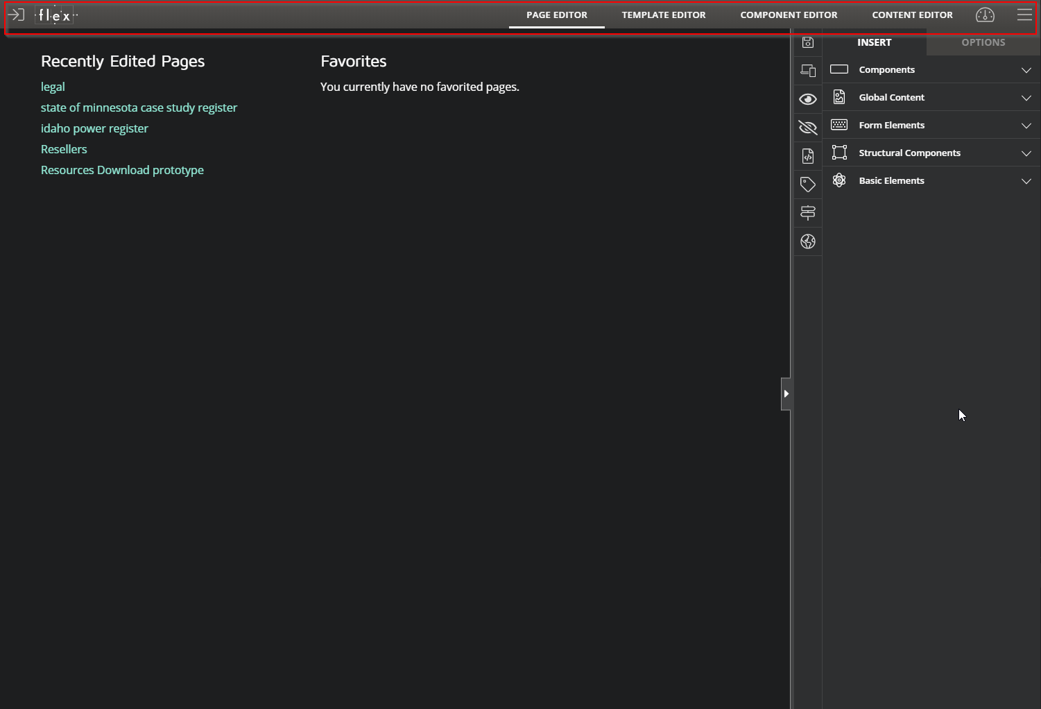
The main menu at the top is where you navigate between the major sections of Flex. You may not see all options, depending on your security level.
- Logout (icon on the left)
- Page Editor
- Template Editor
- Component Editor
- Content Editor (opens directly to page or component you are on)
- Settings Menu
- Menu Button (opens a context aware menu for the section you are in)
# Work Area
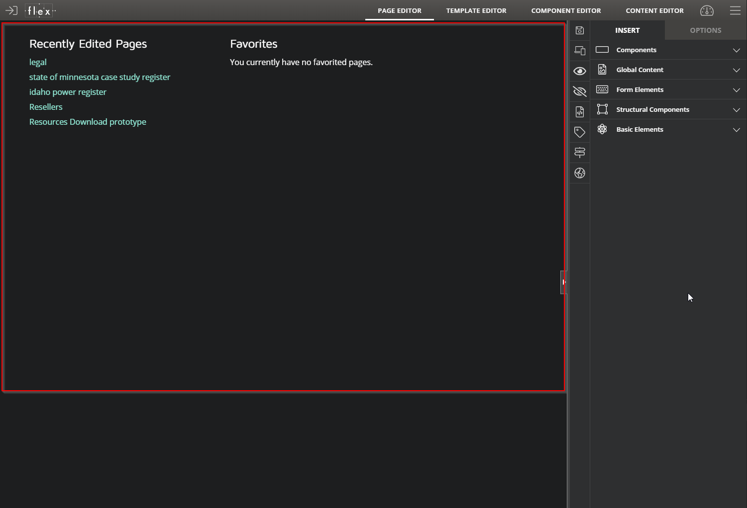
This is where your current page, template or component will appear.
# Vertical Toolbar
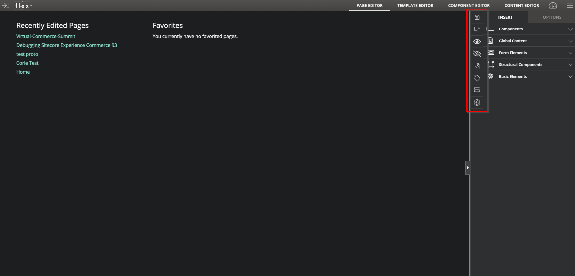
This toolbar will contain editor specific functions for both Page Editor and Component Editor. From top to bottom, here is what each icon represents:
| Icon | Description |
|---|---|
| Allows you to save your changes. This turns red when there are unsaved changes. | |
| Indicates that your changes are being saved. | |
| Allows you to add responsive design. | |
| Switches the editor into Preview Mode. | |
| Toggles the display of any hidden and disabled components. | |
| Allows to edit the page metadata. | |
| Allows to add taxonomy categories and tags for internal searches. | |
| Enables "Guided Select" mode, where the labels for each component element are displayed. | |
| Unlocks the component, so that future Component Editor updates will no longer be received. | |
| Allows you to manage the Workflow. | |
| Allows you to publish the current page. | |
| Adds the current page to your list of favorites. This turns red once it‘s added. |
# Right-hand Menu
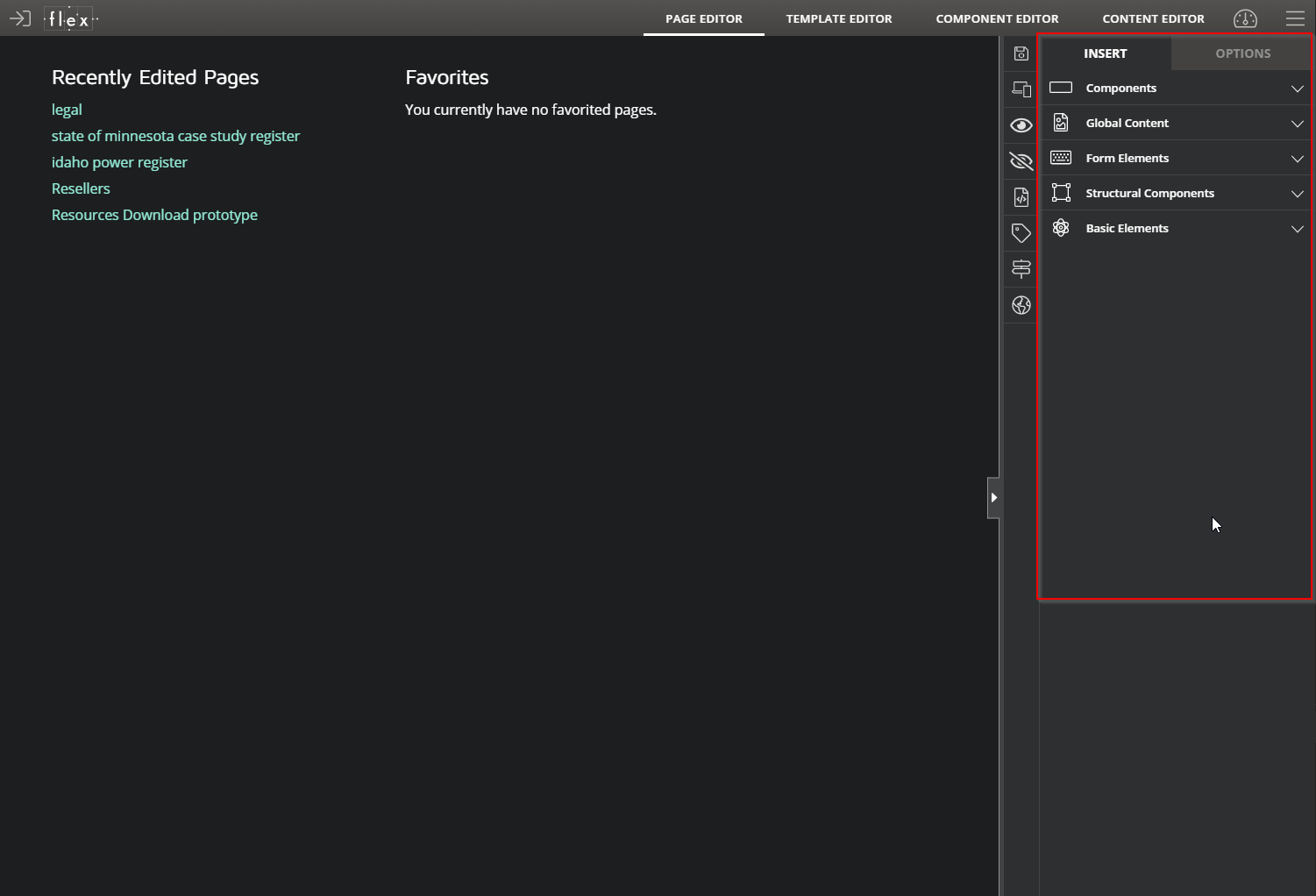
This menu contains the objects used for the drag and drop interface, as well as options for all of your components.